How to Read a Chart Without Being Misled
Read the claim, denominator, scale, uncertainty, and missing comparison before trusting a chart. Then reconstruct the decision it invites.
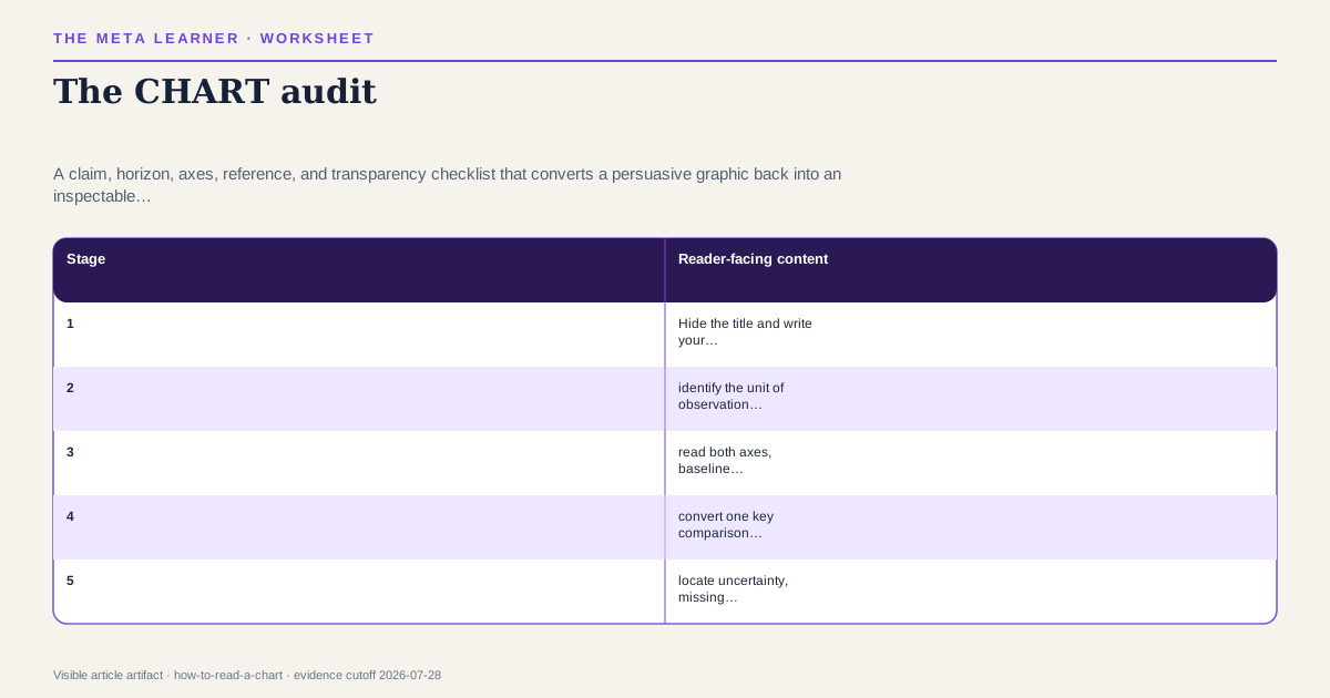
First state the claim the chart appears to make. Then inspect population, denominator, measure, time window, axes, baseline, scale, missing categories, uncertainty, and source. Re-express the pattern in plain numbers and ask which alternative chart or comparison would weaken the impression. A checklist cannot validate the underlying data or causal design, and accessibility can require alternative encodings and descriptions.
The visual claim problem
Charts feel like direct perception: the line rises, the bar towers, the cluster separates. But every graphic maps data through choices about inclusion, aggregation, scale, geometry, and annotation. The chart is not the dataset. The dataset is not the world.
This guide is for readers evaluating news, research, dashboards, investor decks, and AI-generated visualizations. It focuses on the decision hidden inside the display.
Evidence inside the case boundary: the CHART audit
Foundational graphical-perception experiments find that people judge some encodings, such as position on a common scale, more accurately than area or volume. Experimental work also shows that visual design can affect attitudes and interpretation. Official guidance emphasizes appropriate chart choice, honest axes, clear labels, accessible color, and enough context for readers to understand the data.
cleveland-mcgill, pandey-deception, uk-chart-guidanceClaim sources: cleveland-mcgill, pandey-deception, uk-chart-guidance
The CHART audit
C — Claim and comparison. What conclusion does the graphic invite? Compared with what?
H — Horizon and population. Which dates, people, places, and exclusions define the data?
A — Axes and arithmetic. What are the units, transformation, baseline, interval, and denominator?
R — Reference and rivals. Which reference class or alternative display changes the impression?
T — Transparency. Are source, uncertainty, missingness, and methodology available?
Write answers before discussing aesthetics.
Reconstruct the denominator
“Risk doubles” can mean an increase from one case in ten thousand to two. “Most users prefer” can exclude everyone who did not respond. A rate can fall while the count rises because the population changed.
Translate percentages into natural counts where possible:
Among 10,000 comparable people, about 10 experienced the outcome in group A and 20 in group B during one year.
This does not make the difference unimportant. It exposes magnitude and horizon for judgment.
Inspect geometry
Bar length implies comparison from a baseline, so a truncated axis can exaggerate differences. A line chart can legitimately use a restricted range when the purpose is variation, but the choice should be clear. Area and volume encode magnitude less precisely and can amplify visual change. Dual axes can make unrelated series appear synchronized.
Ask: if the same data were shown as points on a common scale, would the claim feel the same?
Look for aggregation traps
An average can conceal subgroup reversal. A national trend can combine regions moving in opposite directions. A monthly series can hide volatility; a daily series can magnify noise. Cumulative totals can only rise, making momentum look inevitable.
Request or reconstruct:
- absolute and relative values;
- counts and denominators;
- subgroup and aggregate views;
- a time horizon justified by the question;
- uncertainty or distribution, not only a mean.
An adversarial chart
A fundraising deck shows revenue climbing 300 percent across four quarters. The y-axis begins near the first value, the company started from a very small base, customer concentration increased, and refunds are excluded.
The visual fact—plotted recognized revenue under the company’s definition—may be accurate. The inference of scalable growth has rivals: one large client, changed recognition, or unsustainable acquisition. The decision requires margin, retention, concentration, and cash—not a repaired axis alone.
Run the CHART audit
- Hide the title and write your own neutral description.
- identify the unit of observation and denominator.
- read both axes, baseline, interval, and transformations.
- convert one key comparison into counts.
- locate uncertainty, missing data, and exclusions.
- redraw mentally on a common scale.
- generate one rival aggregation and one rival causal account.
- open the data or methodology if the decision matters.
- state the narrowest defensible conclusion.
If the graphic is inaccessible, request a data table and a structured textual description. Accessibility also improves auditability.
Reversal and decision conditions
Reverse the chart’s apparent conclusion when corrected denominators remove the pattern, a justified full scale makes the difference practically negligible, the trend depends on an arbitrary window, subgroup analysis reverses the aggregate, or missingness is plausibly decisive.
Do not reverse merely because a zero baseline is absent in every chart. Lines, deviations, and scientific measures can need restricted ranges. The decision boundary is whether geometry truthfully serves the comparison and whether magnitude and uncertainty remain visible.
Visual reasoning failures
When the decision matters, reproduce one comparison from the underlying table or downloadable data. Check whether rounding, filtering, smoothing, or missing values account for the visual pattern. Then write an accessible text description that includes direction, magnitude, denominator, horizon, and uncertainty. If the conclusion cannot survive translation out of the chosen geometry, the chart may be carrying more argumentative weight than the data.
- Reading the title as if it were measured data.
- Checking axes but ignoring population and denominator.
- Treating a corrected scale as proof of causality.
- Inferring individual change from aggregate change.
- Assuming an attractive chart is deceptive or an ugly chart honest.
- Accepting AI-generated labels, units, or sources without verification.
- Demanding every chart show every qualification instead of following the source.
The bounded verdict from the CHART audit
The CHART audit detects common interpretive risks but cannot establish data integrity, sampling validity, statistical identification, or intent to deceive. Graphical conventions vary by domain. Readers with visual, cognitive, or color access needs may require alternative formats. High-stakes conclusions should be checked against underlying data and qualified analysis.
A good chart compresses evidence without concealing the comparison. A good reader knows how to decompress it.
Apply critical thinking, separate facts, inferences, and judgments, and use explicit probabilities in expected-value decisions.
Named sources
Evidence and further reading
Published July 29, 2026. No substantive revision has been recorded. Evidence last verified July 28, 2026.